Pantone Colour of the Year 2025: Mocha Mousse

 Dec , 2024
- Colour
- 4 Min Read
Every year, a new colour takes the spotlight on the global level, influencing everything from fashion and interiors to branding and product design. For 2025, the Pantone Colour of the Year is Mocha Mousse. If you’re wondering, what is the colour of the year 2025, then we have the answer: it’s a neutral brown shade. But this isn't the kind of brown that is similar to the colour of cardboard. This shade of brown is stylish, inviting, and the epitome of elegance.
What Is Pantone Colour And Its History?
Before we look at the Pantone Colour of the Year, let's understand what is Pantone - and why their choice of colour is regarded so highly all over the world. In very simple words, this is part of a global system that is used to standardise colours. The Pantone Colour System was started in the 1960s to let industries like printing, fashion, and design communicate colour correctly. It made sure that a designer in one country and a manufacturer in another could create the exact same colour without any confusion.
But the Pantone Colour System is different from the Pantone Colour of the Year.
The Pantone Colour of the Year began in 2000 as a way to reflect the mood and themes of the year. It has since become a global phenomenon. Each year, Pantone’s colour experts carefully choose a paint colour that captures the spirit of the time and influences how colours are used in homes, clothes, marketing, and technology.
The Evolution Of Pantone’s Colour Of The Year
The Pantone Colour of the Year has come a long way in the last two decades. Previously, the Pantone Colour of the Year like Viva Magenta, Living Coral, and Classic Blue have set trends across industries. Each shade connects to cultural, emotional, and practical trends.
Here are some of our favourites:
- 2021: Illuminating Yellow and Ultimate Grey echoed strength and optimism after the difficult year of 2020.
- 2022: Very Peri, a vibrant bluish-purple colour shade, stood for creativity and change.
- 2023: Viva Magenta was dramatic and bold. As home colour paint, it adds positive energy to homes and wardrobe collections.
- 2024: Peach Fuzz created a more feminine look, and leaned more towards feelings of care and comfort.
The Pantone Colour of the Year is more than just a colour name. This colour impacts the products we buy, the paint on our walls, and even the clothes in our wardrobes.
Criteria For Choosing The Colour Of The Year
The Pantone Colour of the Year is not selected randomly. Pantone colour experts travel all around the world, looking for colour influences in everyday life. They study everything from fashion and art to technology, movies, and even social movements like protests.
They also take into account practical and emotional factors like:
- Mood: Does the colour feel calming, energising, and inspiring?
- Trends: Is there a global theme like minimalism or sustainability that makes a colour relevant?
- Versatility: How well does the colour work across different industries?
The chosen shade represents what the world needs most at that moment.
Mocha Mousse: The Pantone Colour Of The Year 2025

The Pantone Colour of the Year 2025, Mocha Mousse, is a stunning brown that feels calm and sophisticated. It’s not too dark, not too light, and works beautifully in both modern and traditional settings. Mocha Mousse reflects the global shift towards simplicity and a focus on the simpler, more natural parts of life.
Characteristics Of Mocha Mousse
The Pantone colour of the year Mocha Mousse wall paint stands out because of its universal nature and the fact that it is easy to work with. Here’s what makes it special:
- Neutral yet impactful: It adds depth without overpowering a room.
- Easy to blend: It complements other shades like creams, beiges, and natural wood finishes.
- Practical: It hides dust and dirt better than lighter colours, which is great for high-traffic areas.
- Positive Energy: Even as per vastu, light brown shades make rooms feel calmer, perfect for creating relaxing interiors.
Applications Of Mocha Mousse In House Interior & Exterior Design
If you’re thinking about using Mocha Mousse at home, here are some practical ideas:
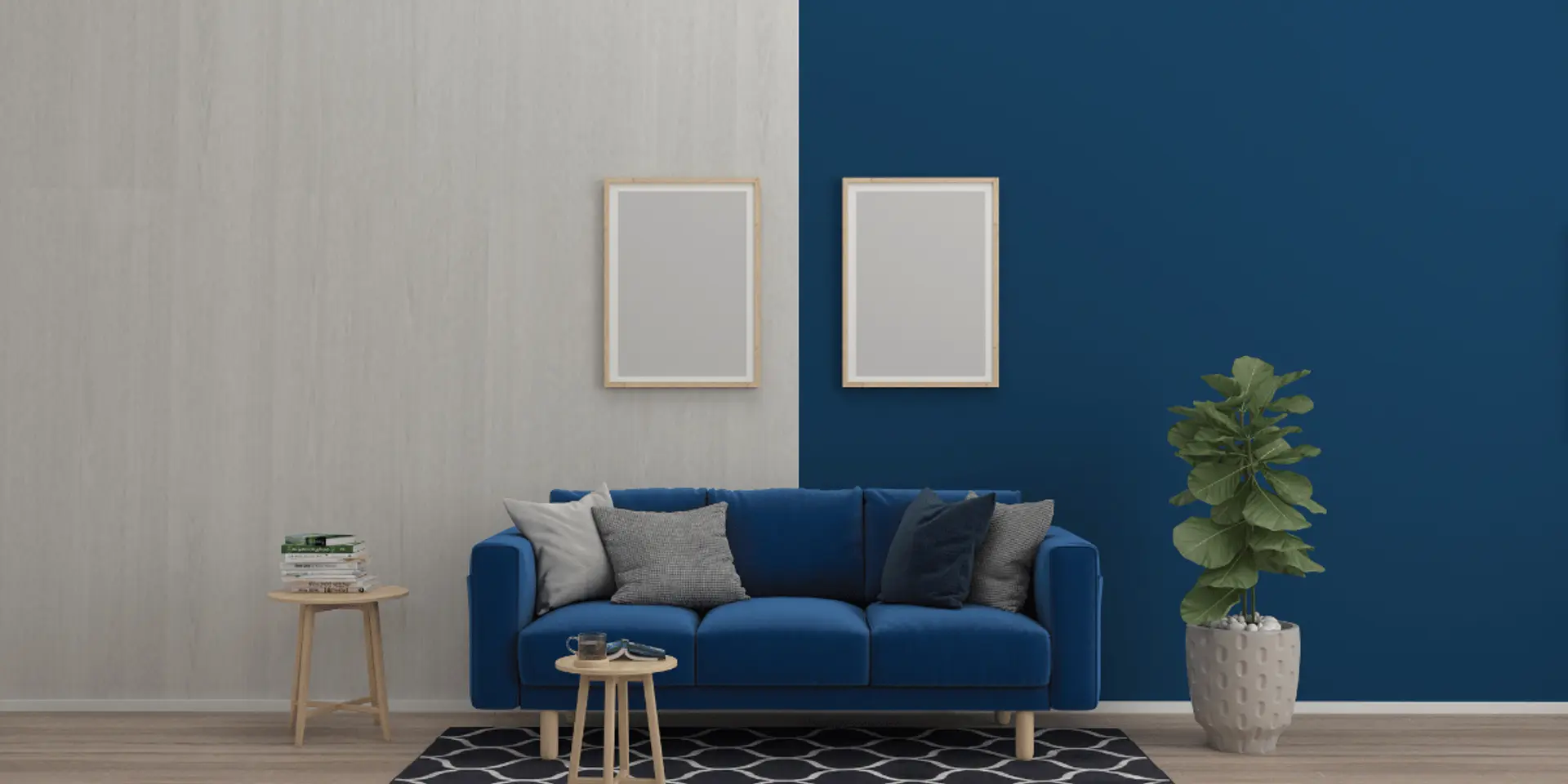
- Living Rooms: Use Mocha Mousse as a feature wall. Combine it with light furniture and decor items for a clean look.
- Bedrooms: We recommend that you paint all four walls in Mocha Mousse to not only create a calm and relaxing environment but do so in a stylish way.
- Kitchens: Mocha Mousse cupboards are a stylish and practical alternative to off-white. They don't show signs of stains very easily which is a necessary feature in areas like the kitchen.
- Exteriors: Go for Mocha Mousse for exterior walls. It’s long-lasting and less likely to show signs of damage in high-pollution areas and heavy rainfall. For such places, you can go for emulsion paint as it will make maintenance even easier.
- Small Rooms: If your room is small, limit Mocha Mousse to smaller sections, like one wall or furniture pieces, to avoid making the room feel cramped.
Exploring The Pantone Colour Shade Card, Code, And Palette
The Pantone shade card is important if you want to get the exact Mocha Mousse shade for your walls, decor, and even your furniture. It gives you a convenient way to compare Mocha Mousse with other similar shades to find the perfect match for your home.
Pantone Shade Card For Mocha Mousse
The Pantone shade card shows a wide range of brown shades, helping you decide if Mocha Mousse is right for your home. It’s especially helpful if you’re matching paint colours for the other walls, furniture, or even smaller showpieces.
Pantone Colour Code And Palette
Mocha Mousse has a specific Pantone colour code, which makes it easy to use in interior design colour schemes. You can find the exact code in a Pantone book or Pantone colour chart. You can also explore the Pantone colour finder or an online colour catalogue to find complementary shades. The Pantone colour palette also offers complementary shades that work well with Mocha Mousse.
If you’re unsure about combining colours, the Pantone colour system makes it simple. It suggests palettes that look balanced and coordinated.
How Mocha Mousse Looks On Home Walls
Mocha Mousse is one of the more practical and stylish Pantone colour shades. That's because it does not require a lot of maintenance. Plus, being a neutral colour, it is very versatile and works in almost any room.
Styling Tips For Mocha Mousse Walls
Here are some simple and smart ways to use the Pantone colour of the year 2024 in your home:
- Feature Walls: Paint just one wall with the Pantone colour of the year and go for neutral colours for the other walls. If you want to take your decor one step ahead, you can also explore the Pantone shades from the previous years to create a stylish and 350-degree Pantone colour palette.
- Full Room Paint: In larger rooms, Mocha Mousse on all four walls creates a modern and cohesive Pantone colour palette.
- Matching with Furniture: Match Mocha Mousse walls with light-coloured decor, like light brown curtains and off-white cushions with a tinge of brown to stick to the Pantone colour system.
- Furniture: If you don’t want to paint walls, go for Mocha Mousse furniture like bookshelves, tables, or cupboards to bring in the Pantone colour subtly.
A Look Back: Pantone Colours Of The Year 2021–24
Pantone Colour Of The Year 2024
The Pantone Colour of the Year 2024 was Peach Fuzz. This Pantone colour was a very light peach shade faint orange mixed with pink and can be used in texture paint to add a pop of colour. The Pantone colour palette for 2024 was all about subtle calmness.
Pantone's Signature Shade Of 2023
The Pantone Colour of the Year 2023 was Viva Magenta. This Pantone colour was a bright red with small touches of pink. It is enough to bring positive energy to any room.
Pantone Vibrant Choice For 2022
The 2022 Pantone Colour of the Year was Very Peri. This Pantone colour, was a combination of blue and purple, creating a fresh yet relaxing vibe.
Pantone Iconic Selection For 2021
The Pantone Colour of the Year of 2021 was a mix: Illuminating Yellow and Ultimate Gray. The Pantone colour palette for that year created a balance between bright yellow and practical grey.
Why Mocha Mousse Is The Perfect Choice For 2025
Mocha Mousse, the Pantone Colour of the Year 2025, is a smart and classy choice for the following reasons.
- Easy to Maintain: Unlike lighter shades like light brown and off-white, the Pantone colour of the year Mocha Mousse doesn’t get dirty easily. This makes it a practical choice because you don't need to worry about constant cleaning and maintenance.
- Budget-Friendly: You don’t need to repaint your entire house. Having just one wall painted in the Pantone colour or a few small showpieces can make a huge difference.
- Versatile: Shades like lime green aren't very versatile—you need to put a lot of thought into which colours will and will not look good with them. That is not the case with 2025's colour of the year, which goes well with most of the colours.
check for any query you have about the blog
Frequently Asked Questions
A Pantone colour is a system that helps standardise colours across various industries. When you refer to a Pantone colour, you are looking at a specific, defined shade that remains consistent no matter where or how it is reproduced. It is used in everything from printing to fashion to painting. The Pantone colour system makes it easy to match colours without any confusion.
The Pantone colour of the year 2025 is Mocha Mousse. It is a shade of brown that creates a sense of calmness and adds sophistication. It’s neither too dark nor too light. When applied to the walls of a room, it adds just the right amount of colour without feeling gaudy or boring.
You can check out the Pantone colour chart, which gives a visual reference of all available Pantone colour shades. You can also use a Pantone colour finder online, where you can insert a description to get the exact Pantone colour code.
A wide range of industries uses Pantone colours, from designers and print shops to fashion brands and interior decorators. If a business needs a precise colour for its logo, products, or advertisements, they take inspiration from the Pantone colour system. Plus, artists and brands across the world use the Pantone colour palette for consistency.
RGB stands for Red, Green, Blue, and is mainly used for digital screens. RGB is based on the light spectrum, which is why shades can change depending on the device. Pantone colours, on the other hand, are physical colours defined by a specific code in the Pantone colour book. These colours stay the same across different media.
Yes, a Pantone colour can be used for wall paint. In fact, the more modern paint companies match their colours to the Pantone colour palette.
A Pantone colour chart is a complete guide that shows all the colours in the Pantone colour palette. Each colour has its unique Pantone colour code, so you can easily reference or select it for your project.
CMYK is used in printing and involves mixing four basic colours (Cyan, Magenta, Yellow, and Black) to create others. Pantone colours, on the other hand, are pre-mixed, so you always know exactly what you’re getting. The Pantone colour system is often used for higher accuracy, while CMYK is more about mixing colours.